!(shipped product)STUDY 02 · PLAYED ON MOVE 6. Re1 · 2022–2025
Fiskars Group design system: one token-based core, two brands shipped
The position
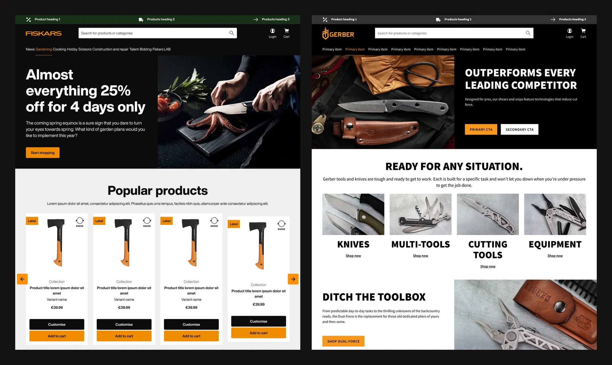
Fiskars Group is a family of brands: Fiskars, Gerber and more. Two were in scope for this project, Fiskars and Gerber.
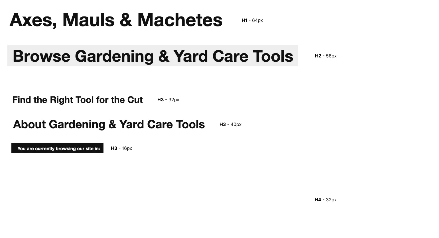
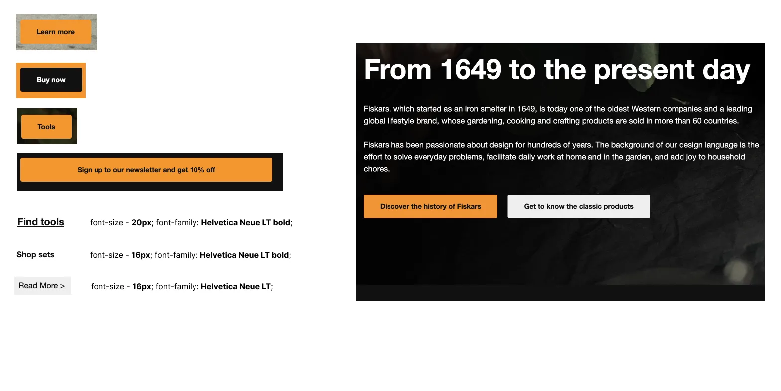
When I started there was no real design system. There were UI kits in Sketch, and the UI designers rebuilt the same patterns by hand. The first thing we did was audit the live site, and it showed what that costs: the same button drawn four different ways, and “H3” headings at three different sizes.
White to move
WHITE TO MOVEHow can one system be good enough to scale to up to seven brands, or more?
Two brands were in scope, but the system had to be ready for the rest of the group, without being rebuilt per brand, and without flattening each brand’s identity.
Candidate moves
- ? (rejected)
Keep the Sketch UI kits
What existed: kits with no shared foundation. Every change was manual work for the UI designers, and nothing connected design to code.
- ?! (dubious)
A classic atomic design system
Atoms, molecules and organisms with hard-coded values, plus a set of pages for every brand. Familiar and quick to start, but each brand would duplicate every component, every change would be made once per brand, and nothing would carry through to code. Fine for two brands; not for seven.
- ! (played)
A multi-brand token architecture
One core system that propagates to every brand, with each brand mapping its own tokens on top. Consistent by default, different where a brand needs it.
The move played
We built a core design system, deliberately neutral, more like a wireframe, that stands on its own. Each brand is an addition to the core, not a fork of it. That split runs through design and code alike:
- Figma: a Core UI library, plus one library per brand. Brand libraries import components from the core, or add new ones when a brand needs something the core doesn’t have.
- GitHub: a core repository, plus one repository per brand. Tokens Studio pushes and pulls each library’s tokens to its own repository as JSON.
Tokens were organised in three tiers. Component tokens point to semantic tokens, semantic tokens point to foundation tokens, and only foundation tokens hold raw values:
145 × 3
Foundation (brand)
brand/core · brand/fiskars · brand/gerber
colour.primary.base: #ef8b00Raw values: colours, type, spacing scales. Where most brand differences live.
276
Semantic
7 sets: colour, typography, spacing, radius, shadow, border, sizing
colour.background.primary → {colour.primary.base}Meaning, not values. The same keys in every brand.
1,089
Component
27 sets, from molecules/cta to organisms/meganav
colour.background.button.primary.hover → {colour.background.primary-light}Every component property points to a semantic token, never to a raw value.
- Core UI library 29 component groups, atoms to organisms, imported by every brand
- Fiskars · Gerber brand libraries and repositories built on the core
- 7 page templates per brand: home, listing, product, cart, checkout, login, account
Token names follow a BEM-style model (block, element, modifier), like colour.background.button.primary.hover. Developers were involved from the start: they helped define the names and structure, and mapped tokens to foundations and components with us. By the time we handed over, they already knew how the system worked, helped build it, and could contribute to it.
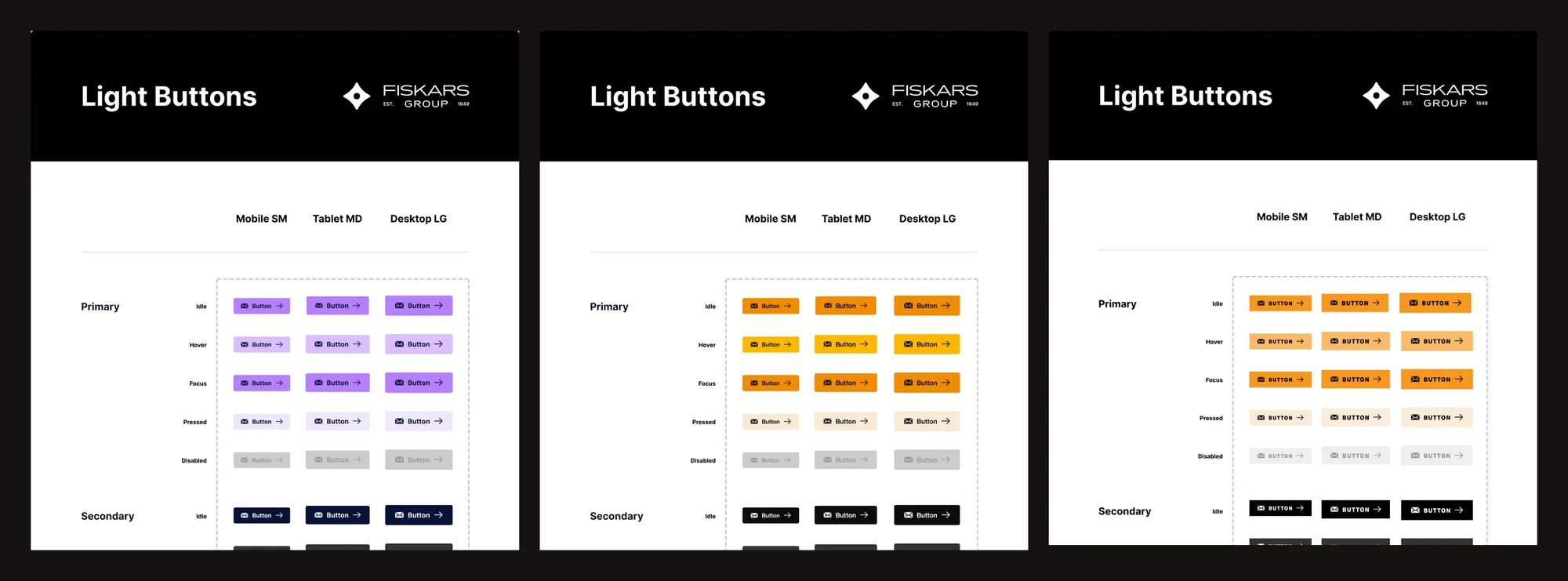
Here is the idea working. It’s the same button and the same token names; picking a brand swaps only the brand layer:
How primary / idle resolves
- components/molecules/cta
colour.background.button.primary.active {colour.background.primary} - semantic/colour
colour.background.primary {colour.primary.base} - brand/core
colour.primary.base #b680fc
- components/molecules/cta
colour.background.button.primary.active {colour.background.primary} - semantic/colour
colour.background.primary {colour.primary.base} - brand/fiskars
colour.primary.base #ef8b00 - Fiskars sets Helvetica Now Display; shown here with the closest system Helvetica.
- components/molecules/cta
colour.background.button.primary.active {colour.background.primary} - semantic/colour
colour.background.primary {colour.primary.base} - brand/gerber
colour.primary.base #f8971d - Gerber overrides radius.button → radius.na (0 px) and maps disabled to grey-bright.
Three ways a brand can be different
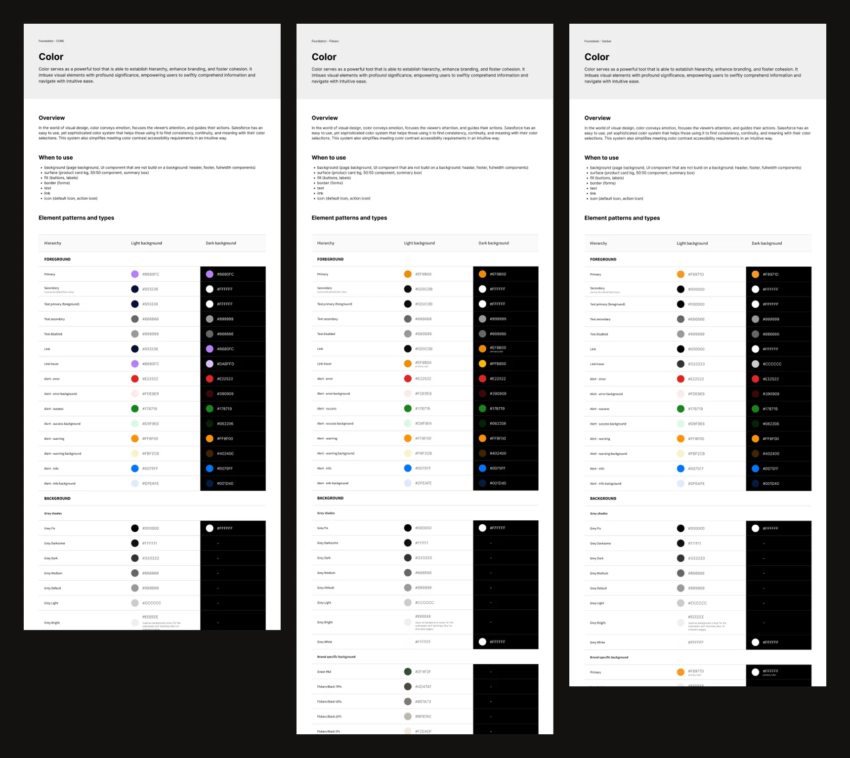
Because every brand keeps the same keys, a brand can be customised at any tier without touching the others. We documented three patterns. These examples come straight from the token files:
Example 1
Same structure, different foundation values
The most common case: identical keys and references, only the raw value changes.
colour.primary.base
- Core
- #b680fc
- Fiskars
- #ef8b00 (differs from Core)
- Gerber
- #f8971d (differs from Core)
Example 2
A component token points to another semantic token
The key stays the same, so code never changes; only what it references does.
colour.background.button.primary.disabled
- Core
- {colour.background.grey-light}
- Fiskars
- {colour.background.grey-light}
- Gerber
- {colour.background.grey-bright} (differs from Core)
Example 3
A semantic token points to another foundation token
A brand can re-map what a meaning resolves to, here the info colour.
colour.background.info
- Core
- {colour.info.1}
- Fiskars
- {colour.info.3} (differs from Core)
- Gerber
- {colour.info.1}
Flexibility like this needs guardrails, so we wrote three rules:
- Never change the keys or values of foundation tokens. If the foundation needs something new, add a token, because changing an existing one can break the semantic and component layers above it.
- Never change a semantic token unless the change should apply everywhere it’s used. As with foundations, add rather than edit.
- Never change the key of a component token. Its value can change; its key can’t. Identical keys across every brand are what let developers skip code changes when the design changes.
From Figma to code
Tokens weren’t a design-only artefact: the same JSON became the CSS developers used. Each component went through the same route:
- DesignTokenise the componentReplace hard-coded colours, type, spacing, borders, shadows and sizing with tokens, in a new component set.
- DesignCheckInspect for broken token links, and confirm the tokens show correctly in Figma Dev Mode.
- Front-end devReviewA developer reviews the tokens before implementation starts.
- Tokens StudioPush to GitHubTokens go to the design/figma-tokens branch, with a pull request into develop.
- DevMerge + buildApprove and merge, then run the Style Dictionary build to generate variables.css.
The build is a small Style Dictionary script with the Tokens Studio transforms. Here is the core of it, from our documentation:
const { registerTransforms } = require('@tokens-studio/sd-transforms')
const StyleDictionary = require('style-dictionary')
registerTransforms(StyleDictionary)

const sd = StyleDictionary.extend({
  source: ['tokens/brand/core.json', 'tokens/semantic/*.json', 'tokens/components/*.json'],
  platforms: {
    css: {
      transformGroup: 'tokens-studio',
      buildPath: 'assets/',
      files: [{ destination: 'variables.css', format: 'css/variables', options: { outputReferences: true } }],
    },
  },
})

sd.cleanAllPlatforms()
sd.buildAllPlatforms()
outputReferences: true keeps the alias chain in the CSS: a component variable points at a semantic variable instead of a copied hex value, so the tiers survive into code.
Rolling a component out to a brand
Once a component was tokenised and published in the Core UI library, bringing it to a brand was a repeatable routine:
- Drag the component from the Core UI library into the brand library and rebuild its variants (type, size, state).
- Create a token set with the same name in the brand file, then copy the core set’s JSON across in Tokens Studio. The whole structure arrives in one paste.
- Change only the values the brand needs. If a reference points to a semantic token the brand doesn’t have yet, create it in the brand library.
- Apply the tokens, then push to the brand’s repository.
At first the migrated buttons look exactly like Core. Only the token values make them Fiskars or Gerber.

Result +-
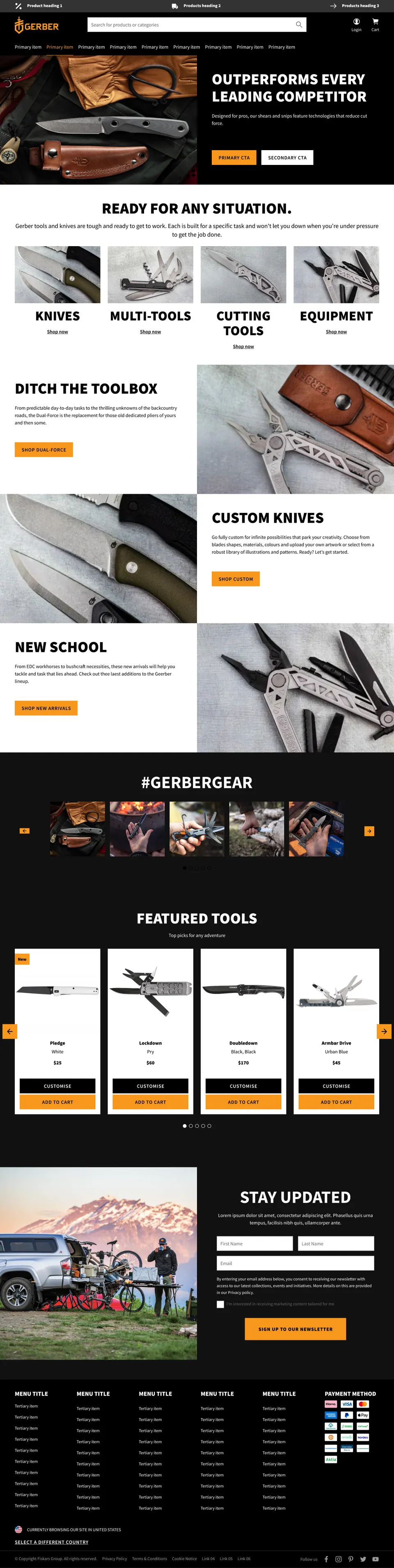
- brands shipped on one core: Fiskars and Gerber (three, counting Core)
- 2
- design tokens in three tiers, shared by every brand
- 1,510
We shipped Fiskars and Gerber on the same core, and saved a lot of time doing it. Adoption was high, and the work changed for the UI designers: instead of redrawing patterns by hand in Sketch, their updates now flow through tokens.
The set-up is ready for the next brand: a new brand library and repository on the same core, with components rolled out by copying token sets and changing values.
Post-game analysis
This was built before Figma variables existed and before AI tools could help, so Tokens Studio was the best option at the time, and we used what we had.
Today I’d spend more time on the token structure up front, and find a better way to accommodate every brand and every team with fewer files. This first project ran across ten Figma files for two brands.